

Our growth sessions at Superwall always come packed with tips, tricks, and trends from the industry, and today's was no different. Nick told us all about two paywall designs that are almost universally increasing conversions, and more importantly, ARPU. Beyond that, we fielded several great questions from the audience.
Follow our social calendar here so you can join the next one, but for now — I'm going to recap some of the interesting parts we covered.
Check out the slides here, or watch the entire session on YouTube here.
Multi-page paywalls
The first design Nick covered was the multi-page paywall:
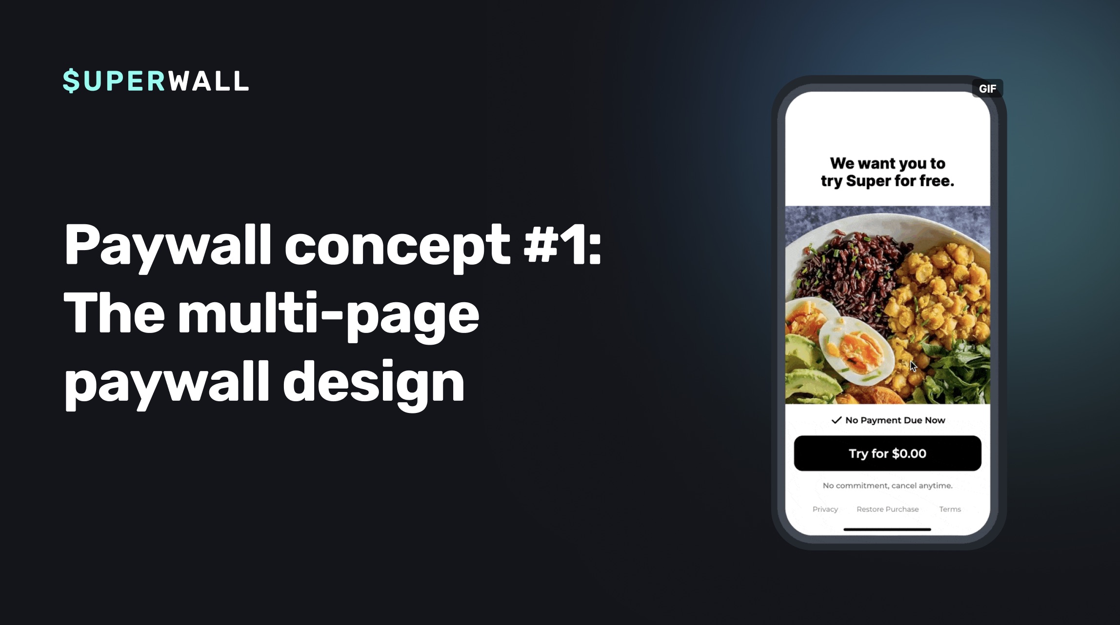
Typically, Nick recommends three or four steps in this paywall flow. Each step is there to reduce a user's anxiety about starting a trial or purchasing a subscription. The key here is to create a tight narrative, and reduce cognitive load. We've found that spreading out critical information across a few steps help user's understand value propositions better, reduce trial anxiety, and feel more confident in what they're purchasing:
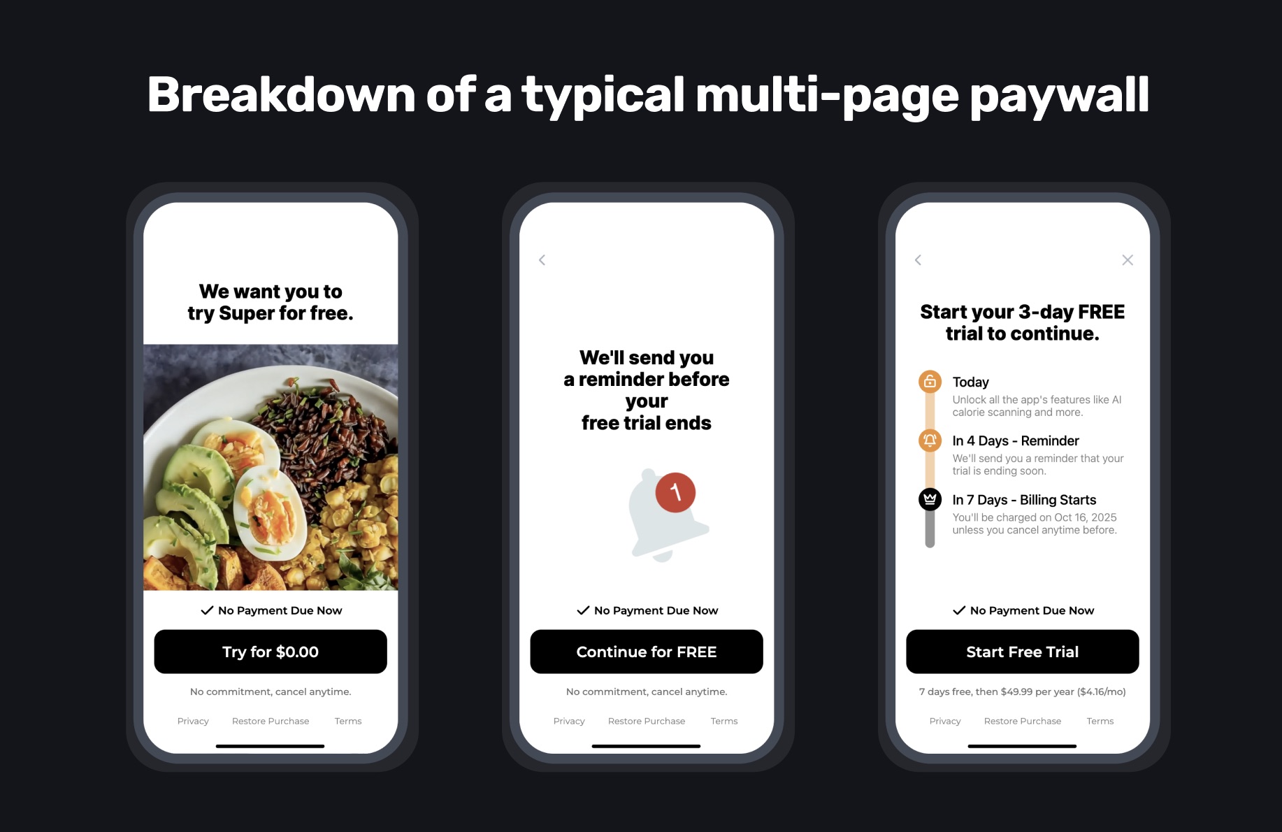
Here's a generalized breakdown of the pages we tend to use:
The value prop and trial page: What's the "Aha!" moment of your app, why do they want it? How will you pacakge the free trial?
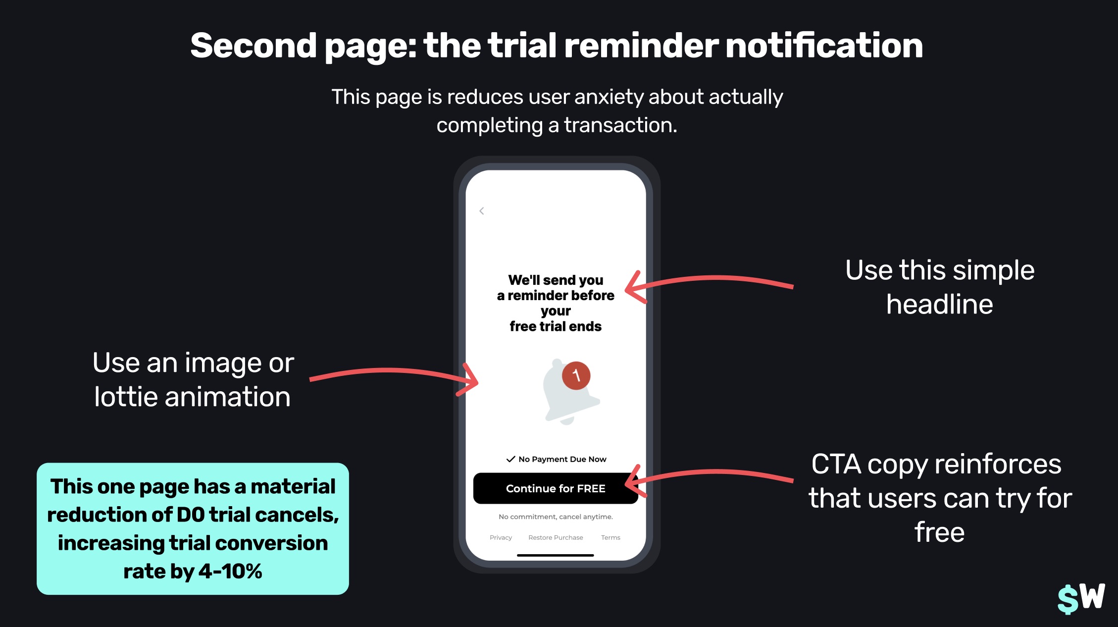
The trial reminder page: This page can combat trial anxiety, and let's users know they are in control of knowing when the trial will finish so they can make a purchasing decision.
The purchase decision screen: UI to help users reinforce the purchase and follow through on it.
The trial reminder page is critical. Why? It reduces the number of users who immediately cancel a trial after they start one. This user behavior is prevalent across iOS, and this is your best weapon against it. If they know they'll get a notification, they feel less risk.
We covered a lot of ground about these types of paywalls, be sure to check out the entire session from the linked YouTube video above to see Nick dig into all of the details.
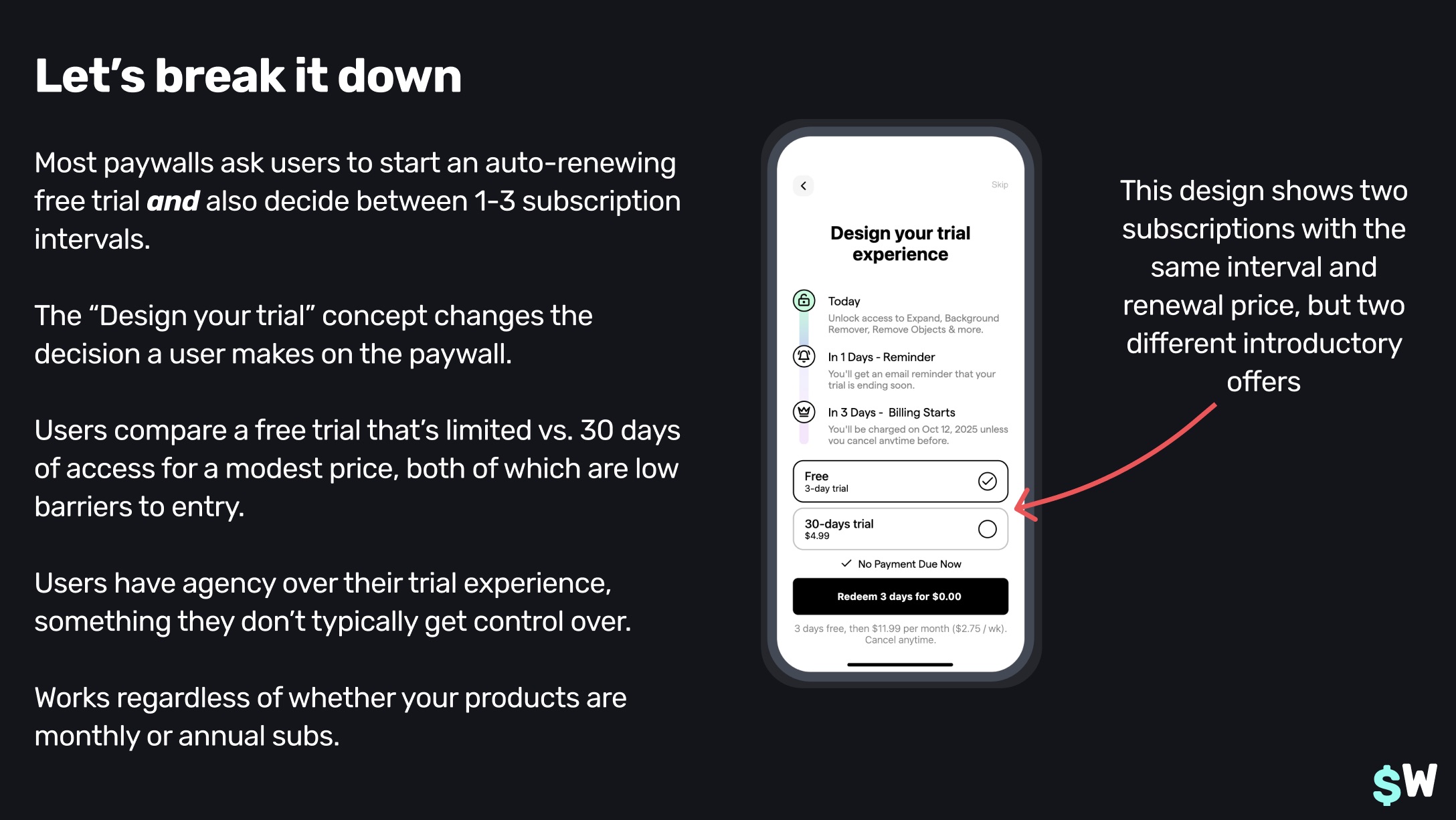
Design your trial
Next, we have the "Design your trial" variation:
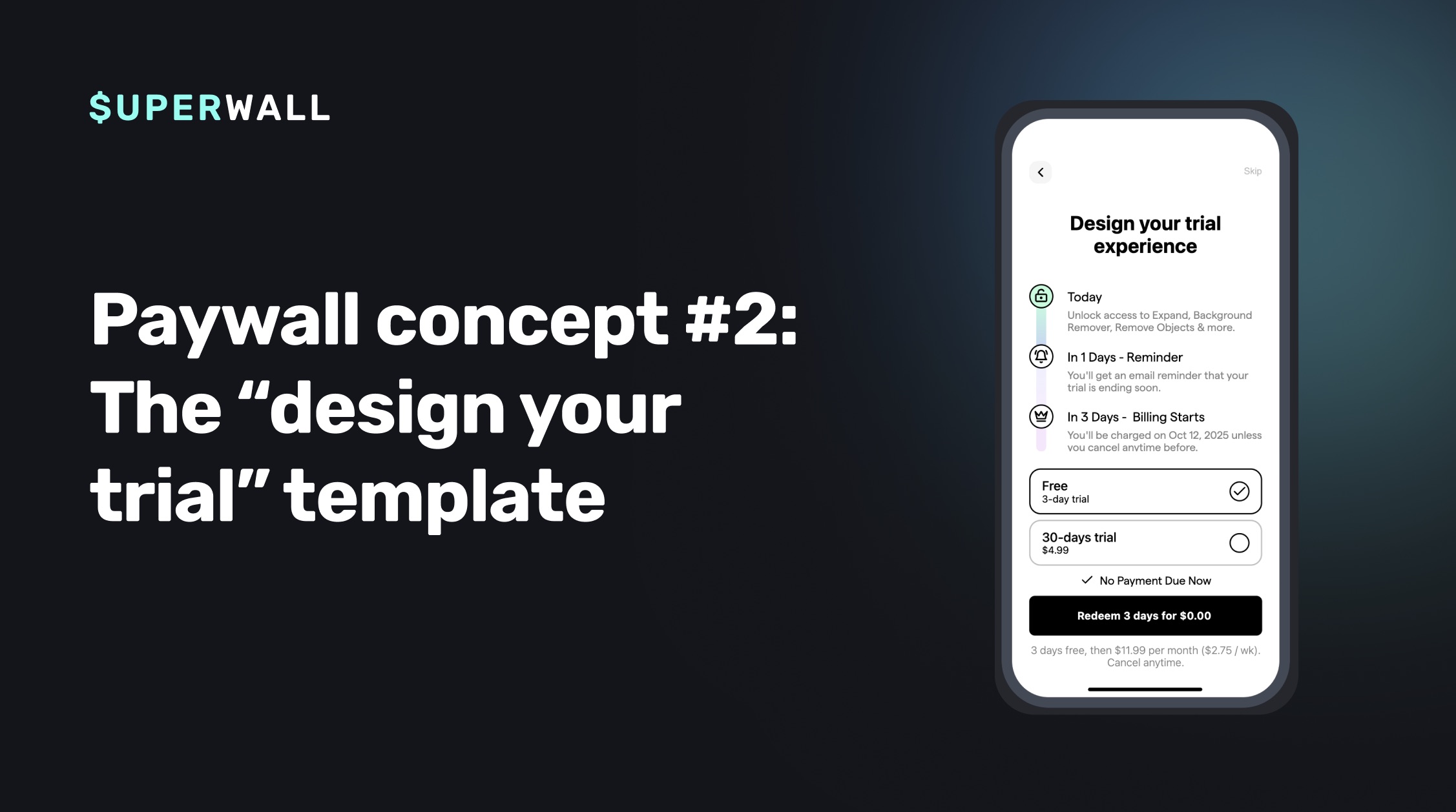
Instead of writing about the "why" with this design, I'll let Nick's slide do the talking (which does a phenomenal job of explaining the motivations behind it):
Combining both of them together
Now, here's a great one to test today — combining both of these together! With the trial-reducing impact of multi-page paywalls, their reduction in cognitive load paired with the user's power of choice in designing their trial, we arrive at this approach:
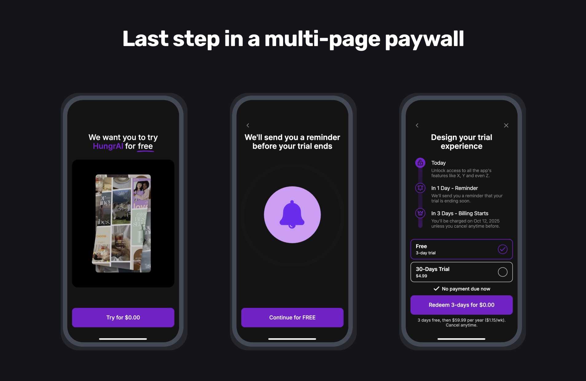
We've recently seen this one "win" in a lot of tests internally, and that's across so many different app categories. It's definitely one to consider for yourself. Now, let's cover some of the questions and answers from the growth session.
Audience Q&A
Regarding the multi-page paywall design:
Question: Hey guys, thank you for hosting this webinar! For the multiple step paywall, on the first page, do you know if having a video boosts conversion more than a photo?
Answer: You should test it! Whatever you show, it should really tie into the core value proposition of your app. The format is less important than showing the core value prop.
Question: I have another question about the multiple step paywall. Do you know if placing it very early in the beginning boosts ARPU? Answer: After onboarding, or even for onboarding. We don't recommend using this format in post-onboarding.
Question: Do you have results from testing just the first page of the multi-page paywall vs the entire multi-page paywall? Answer: You have to bundle more things together if you do it that way. We've tested both, usually it ends up being more minimal if you try to put it all in one. Though, it's a bit more jarring to lead with. At that point, you're basically at a "vanilla" paywall UX. By using a multi-page paywall, you can spread that information density out. It reduces congnitive load. As aways, test it though!
Question: Does this apply to all kind of apps? Answer: Short answer? Yes! We've tested it with virtually every kind of app genre, and we've yet to face a category where it hasn't worked. We have the data, and we're seeing a 97% success rate. But that also implies it didn't work in a few apps. So, again, you have to test it!
Question: Are these uplift numbers the same if you already have a Blinkist-type paywall that isn’t broken out into 3 steps? Answer: Yes, it still does. Our hypothesis is that users are used to that trial timeline view at this point, it's not as novel as it used to be. That's another reason why we generally prefer social proof designs with accolades in place of them.
Question: How can we make this paywall in Superwall? Answer: We have several templates using this design (and the other paywall trend we covered) ready for you to try today!
Question: Any thoughts on hiding or showing the close button, or delaying it? Answer: It's really a question of a hard paywall versus a soft paywall. In terms of these paywall trends, it's an adjacent idea - so run two tests with these designs (one with the close button and one without). Plan variation comes into play here, too. And, an exit offer can help quite a bit when there's monthly trials in our experience.
"Design your own trial" questions:
Question: What would be a better paywall format for post-onboarding, then? The first trend or second? Answer: Test them both! Don't ever trust that whatever has worked for someone else will work for you. Even here, with this data we're showing. It may work for you, but it's just data. That's why we built Superwall to test quickly, it's critical. You simply have to do it.
Question: Have you noticed any differences in results based on price point? Do higher or lower price points have different results with this design? Answer: We've seen this perform well with all price points. It's flexible in that regard. Of course, the higher the price the lower the initial conversion. But, if you have baseline data to compare against, then you can identify a lift. But, yes, we've seen this work with $100 subscriptions down to a few dollars.
General questions:
Question: When you say running multiple variants at the same time, does that mean one campaign in Superwall with, for example, 4 variants, and each being allocated 25% of the traffic? Answer: Yes! We recommend creating a new audience that houses each variant in your campaign per test. If you're testing four variants, put them each at 25% traffic within the audience you made for the test. Then, you can pause it easily and always attribute back revenue to that test as well. It keeps your data clean and easy to maintain.
Question: What’s your take on weekly pricing - worth the hype? Answer: It's really there as a price anchor to make your monthly or annual plan look more attractive. Try it as a test, though we have seen weekly plans that can work but the number of apps they truly make sense for is generally small. So, basically — it's a decoy in a sense to boost value perception of longer duration plans.
Question: Did the combined approach perform better than the separate designs? Answer: In our tests, yes, they did! It collates critical learnings from both approaches into one design. But, and we will always say this, run your tests! You can even put these against each other, the data will show you what's working.
Question: Have you identified a winning trial duration period for the second paywall design? Answer: It depends on how long it takes to get to your app's "Aha!" moment. They have to experience that during the trial duration. For example, if you had a spam call blocking app — the user may not have had a spam call in three days, but they probably would within a week. So, a week is clearly the better option so they can actually experience the value that it brings. Try to base trial lengths off of that.
Question: When running such paywall tests, how many new users is enough data to conclude the experiment? Answer: It depends on the scope of the test, really. We think that the bigger the difference between the variants, the less users you need to run it (generally speaking). It'll be more noticeable, and more quickly (i.e. trying two completely different designs rather than a slight copy change). 200 conversions for some apps is a lot, for others that's nothing. What you're after is data that helps you make a decision, so the number of users enrolled in one is simply a single part of the equation.
Question: Is testing more paywalls always better (like 8 at once)? Or, is it better to test 2-3 at a time Answer: It depends on install volume. If you're getting at or around 1,000 a week, you could run two to three variants and have concrete results to make further decisions pretty easily. Internally, we tend to favor two to three variants when testing core concepts - it reduces the amount of time you're "risking" on the test. However, if you're trying a big price test with about four different price points, you might run those at once to quickly eliminate poor performers.
Question: Can you link to the tools mentioned? Answer: Rotato and Shots for device videos and mocks, and ffmpeg for reducing video sizes.
Wrapping up
These two paywall patterns are performing well, consider giving them a try in your own apps today. Of course, the easiest way to do that is with Superwall, and you can push live, over-the-air updates with our platform. If you don't have an account, you can sign up for free right now.
I hope to see you at our next growth session, and as always — I'll be here recapping every single one. Be sure to keep it locked to our blog for that, and much more.